Learn Python with NFL Data - Estimated Points Added

Learn how to use Python to visualize estimated points added for defenses and offenses in the 2020 season.
Learn how to use Python to visualize estimated points added for defenses and offenses in the 2020 season.
If you have any questions about the code here, feel free to reach out to me on Twitter or on Reddit.
If you like Fantasy Football and have an interest in learning how to code, check out our Ultimate Guide on Learning Python with Fantasy Football Online Course. Here is a link to purchase for 15% off. The course includes 15 chapters of material, 14 hours of video, hundreds of data sets, lifetime updates, and a Slack channel invite to join the Fantasy Football with Python community.
In this post, we're going to do something that's more general NFL-analytics than straight Fantasy Football analysis.
We're going to be using nflFastR's EPA (Estimated Points Added) model to visualize the best offenses and defenses in the league.
nflFastR's play by play data comes with EPA data for each play. EPA is a model that estimates the expected points added per individual play based on starting and ending field position, down, and field goal distance.
Each play has an EPA, and we're going to be finding each team's EPA per play on offense and defense. For offense, it's straight forward. If a play has an EPA of 1.2 on offense, that means the offense moved the ball such that they added an expected 1.2 points to their score. For defense, it's going to be the opposite. If a team is on defense, and the EPA for the play is 1.2, then we'll say the defense gave up or allowed an estimated 1.2 points on the play. Team defenses with more negative EPAs are better defenses, while team defenses with more positive EPAs are worse defenses.
First things first, load up your Google colab or jupyter notebook and import the libraries we'll need for this post.
Next, we'll load in 2020 play by play data via nflfastR.
Here, we're making a DataFrame called epa_df which will sum up team EPAs for each play and we'll also count the number of plays. In a moment, we'll also visualize the relationship between team offensive yardage and team EPA / play.
| offense_epa | offense_plays | offense_yards | offense_epa/play | |
|---|---|---|---|---|
| GB | 65.157290 | 412 | 1985.0 | 0.158149 |
| SEA | 63.130746 | 404 | 1981.0 | 0.156264 |
| KC | 77.177112 | 513 | 2506.0 | 0.150443 |
| TEN | 64.371111 | 444 | 2118.0 | 0.144980 |
| LV | 52.702453 | 421 | 1997.0 | 0.125184 |
No surprises here, top three offenses are what we'd expect. Green Bay, though, was head and shoulders above every other team in terms of offensive efficiency though before last week. Now, they only hold a slim lead over Seattle.
Let's move on to visualizing the relationship between yardage and EPA per play. We'll also use the scipy.stats package to find the R-squared and place it in the plot title.
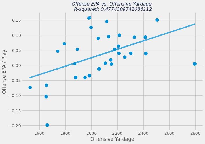
We can see there is some correlation between yardage and offensive EPA per play. The correlation is actually stronger when you look at team touchdowns. We'll move on, though, to finding defense EPA/play. Since the DataFrame is already instantiated, let's just add the defense columns via assignment.
| offense_epa | offense_plays | offense_yards | offense_epa/play | defense_epa | defense_plays | defense_epa/play | defense_yards_given_up | |
|---|---|---|---|---|---|---|---|---|
| JAX | 3.126140 | 484 | 2107.0 | 0.006459 | 72.403214 | 496 | 0.145974 | 2487.0 |
| HOU | 28.410280 | 450 | 2208.0 | 0.063134 | 69.309387 | 521 | 0.133031 | 2548.0 |
| LV | 52.702453 | 421 | 1997.0 | 0.125184 | 52.378947 | 406 | 0.129012 | 1972.0 |
| DAL | 2.566651 | 571 | 2795.0 | 0.004495 | 65.955793 | 538 | 0.122594 | 2466.0 |
| BUF | 48.368825 | 485 | 2215.0 | 0.099730 | 60.290923 | 495 | 0.121800 | 2329.0 |
These are the 5 worst defenses in the league by EPA per play. Remember, more positive EPAs per play on the defense side are bad. This means the defense is allowing (an estimated amount) of more points per play.
Let's now visualize the relationship between defensive yards given up by a team and defensive EPA.
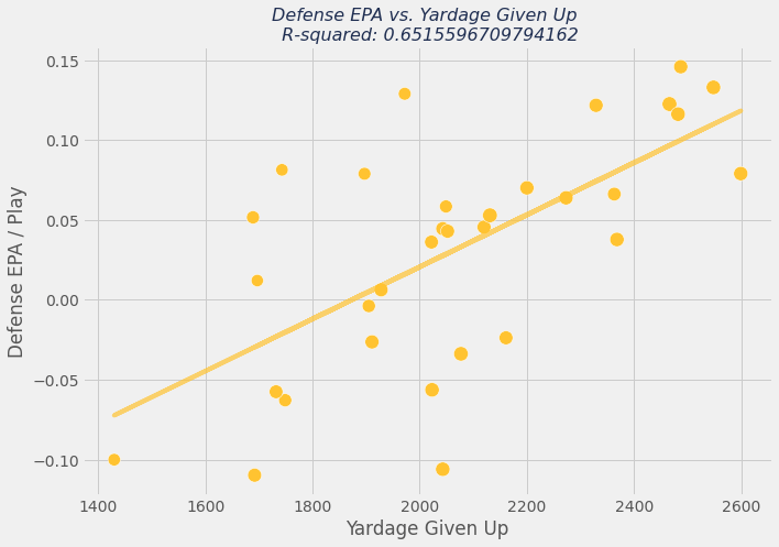
We can see here that the correlation between defensive EPA and defensive yardage given up is a bit tighter than offensive EPA and offensive yardage.
Let's tie everything together and scatter plot defensive EPA on the y-axis and offensive EPA on the x-axis. This will clearly demonstrate which teams have a good defense and good offense, bad defense and good offense, bad defense and bad offense, and good defense and bad offense.
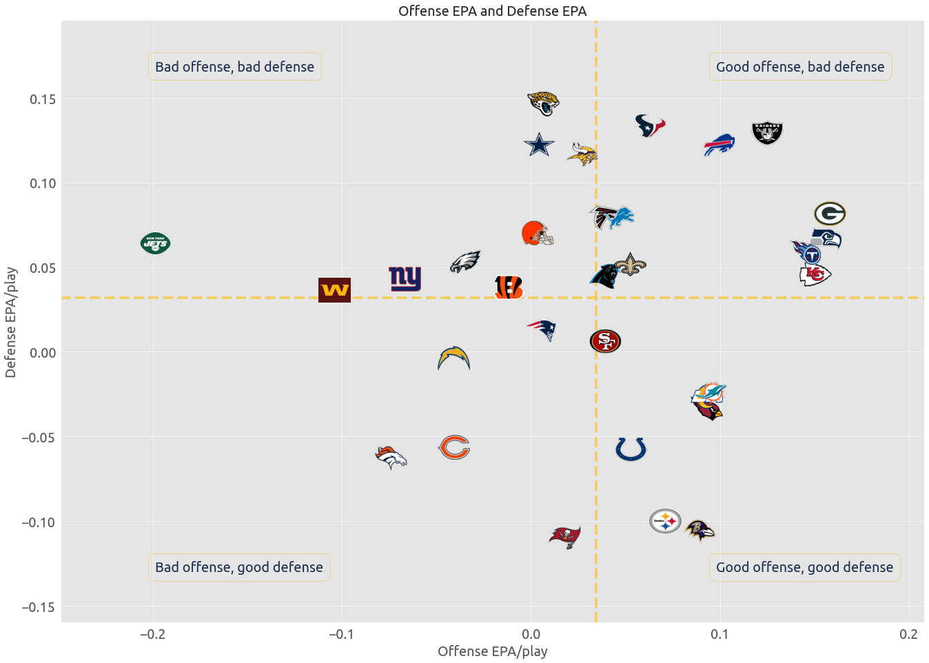
And that's it! The visualization is pretty self explanatory, and some of the results make a lot of sense if you've been following the NFL this season. The New York Jets are doing a fantastic job of social distancing.
Thanks for reading!