Learn Python with Fantasy Football: Plotting Yards After Catch
 Photo by Joe Nicholson, USA TODAY Sports
Learn how to use Python to plot WR yards after catch for the 2020 season.
Photo by Joe Nicholson, USA TODAY Sports
Learn how to use Python to plot WR yards after catch for the 2020 season.
If you have any questions about the code here, feel free to reach out to me on Twitter or on Reddit.
If you like Fantasy Football and have an interest in learning how to code, check out our Ultimate Guide on Learning Python with Fantasy Football Online Course. Here is a link to purchase for 15% off. The course includes 16 chapters of material, 14 hours of video, hundreds of data sets, lifetime updates, and a Slack channel invite to join the Fantasy Football with Python community.
In this part of the intermediate series, we're going to continue looking YAC yardage for some of the top receivers of the
2020 season. This time, we are going to be looking at all receivers instead of just the WR position.
What we'll be doing in this post is plotting the distribution of YAC yardage as a kernel density estimation
for the top 10 YAC receivers this season (it's week 16 as of the time I'm writing this). The point of plotting
YAC distributions is to find those players with the potential to break out huge runs after the catch. As we'll see
later in this post, 2 of the 10 players we'll be plotting the distributions for are RBs (Kamara and McKissic), and we don't typically of
RBs when thinking of YAC numbers.
Given that, I can encourage you to edit the code to not only include the top receivers in terms of YAC yardage,
but maybe the top 10 receivers who are most relevant to your team, current matchup, and league.
The first thing we'll do is, as always, install the nflfastpy package. If you are working from Jupyter and already
have this package installed on your local machine, you can skip this step. If you're working from Jupyter
and don't have the package installed, conda install nflfastpy or pip install nflfastpy from your terminal.
If you're using Google Colab, though, you'll have to install the package to your runtime using the command
below in a seperate cell.
Next, we'll import our standard libraries. requests and BytesIO will be used later in the code to
display player headshots through pyplot's imshow function.
Next, we'll grab and compile some data for use later in this post. The comments below
run you through what each line is doing.
| gsis_id | receiver_player_name | posteam | position | yac | |
|---|---|---|---|---|---|
| 264 | 00-0033906 | A.Kamara | NO | RB | 716.0 |
| 74 | 00-0030506 | T.Kelce | KC | TE | 543.0 |
| 100 | 00-0031381 | D.Adams | GB | WR | 535.0 |
| 115 | 00-0031610 | D.Waller | LV | TE | 504.0 |
| 265 | 00-0033908 | C.Kupp | LA | WR | 498.0 |
Awesome, so now we have our df object ready for use in plotting with matplotlib.
Above, we can see the top 5 YAC receivers this year. We can see that Kamara is the leading YAC receiver this year by a healthy margin.
If you run head(10) off our df, you'll be able to see that JD McKissic is the #10 receiver this year in terms of YAC yardage.
Robert Woods is in the top 10 as well, which means the Rams have two receivers this year in the top 10.
Kelce and Waller both in the top 5, and the only TEs in the top 10 (unsuprising). Kelce has a narrow lead of 40 yards over Waller. Both have had fantastic seasons this year, and if you had either
on your team this year you probably made it to the playoffs, given how valuable a good TE was this year.
Moving on, what we'll do now is create a DataFrame that has the top 10 YAC receivers and use that to filter our original df with play by play data.
| gsis_id | receiver_player_name | yac | |
|---|---|---|---|
| 261 | 00-0033906 | A.Kamara | 716.0 |
| 72 | 00-0030506 | T.Kelce | 543.0 |
| 98 | 00-0031381 | D.Adams | 535.0 |
| 113 | 00-0031610 | D.Waller | 504.0 |
| 262 | 00-0033908 | C.Kupp | 498.0 |
| 76 | 00-0030564 | D.Hopkins | 489.0 |
| 155 | 00-0032688 | R.Anderson | 477.0 |
| 65 | 00-0030431 | R.Woods | 475.0 |
| 435 | 00-0035659 | T.McLaurin | 465.0 |
| 154 | 00-0032602 | J.McKissic | 435.0 |
Now, using this top_10 object, all we have to do is filter our DataFrame using the isin method.
| gsis_id | receiver_player_name | posteam | yac | position | headshot_url | team_color | team_color2 | |
|---|---|---|---|---|---|---|---|---|
| 501 | 00-0030564 | D.Hopkins | ARI | 0.0 | WR | https://a.espncdn.com/combiner/i?img=/i/headsh... | #97233f | #000000 |
| 502 | 00-0030564 | D.Hopkins | ARI | 5.0 | WR | https://a.espncdn.com/combiner/i?img=/i/headsh... | #97233f | #000000 |
| 503 | 00-0030564 | D.Hopkins | ARI | 0.0 | WR | https://a.espncdn.com/combiner/i?img=/i/headsh... | #97233f | #000000 |
| 504 | 00-0030564 | D.Hopkins | ARI | 0.0 | WR | https://a.espncdn.com/combiner/i?img=/i/headsh... | #97233f | #000000 |
| 505 | 00-0030564 | D.Hopkins | ARI | 14.0 | WR | https://a.espncdn.com/combiner/i?img=/i/headsh... | #97233f | #000000 |
We have now have our df DataFrame fully ready for plotting with matplotlib. Below, I've wrote a comment
for each line detailing what each line is doing. Essentially, we're going to be creating 10 axis's (2 columns x 5 rows)
and plotting each player's KDE of their YAC yardage on a sepearate axis. Each axis will have a player image and KDE plot with the player's team color as the line color.
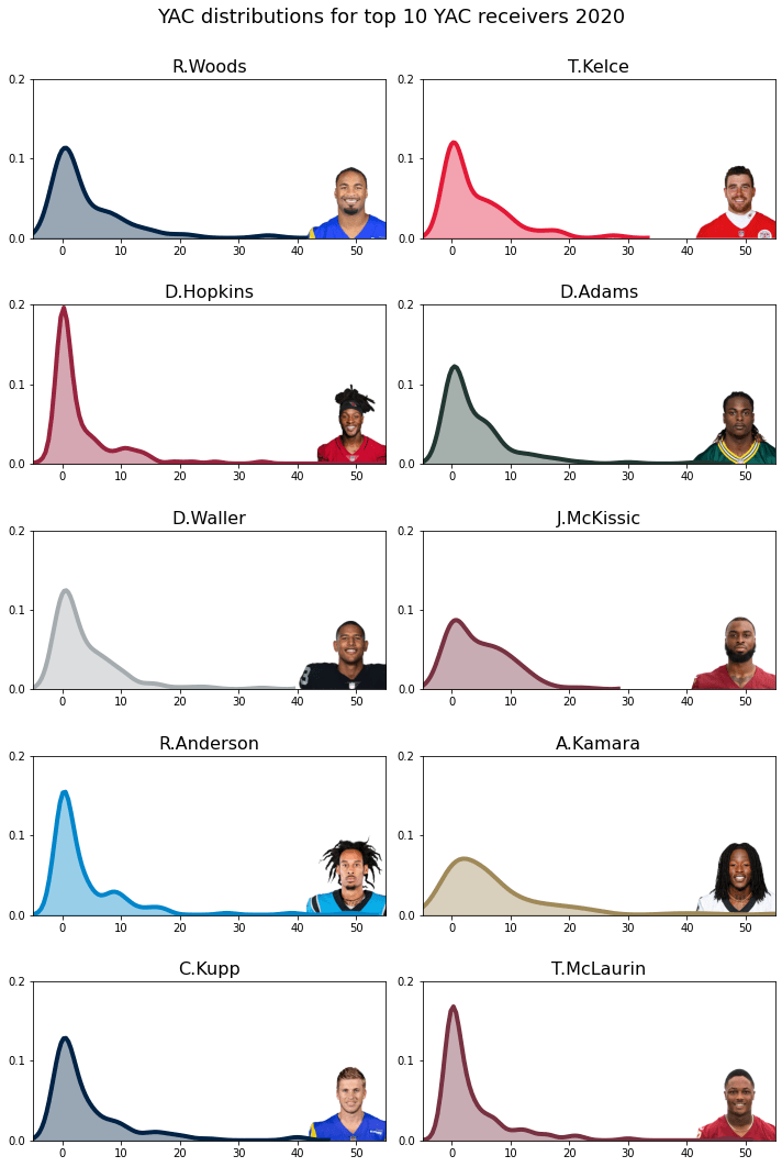
And that's it for this post. We can see most players have a similar YAC distribution. Interestingly, all players have their
maximum likelihood around 0, but it looks like RBs are less likely than WRs to have their plays stopped short at the yardline where the
reception was made. When you think about it, that makes sense. The goal of designed RB pass plays is to acrrue yardage through YAC, not air yards (in other words, RBs, typically, aren't running deep route patterns).
Thanks for reading. If you have any questions about the post, shoot me an email [email protected]