Learn Python with Fantasy Football - In Depth Rushing Analysis
Learn how to use Python to find those player's with the highest opportunity rushing attempts.
Learn how to use Python to find those player's with the highest opportunity rushing attempts.
In this post, we create a visualization using matplotlib and pandas to find where some notable RB's have been getting their carries through six weeks in to the 2021 season (how far away from the endzone). For each player with over 10 rushing attempts, we are going to be counting the number of times they ran the ball in the 0 - 10 yardline zone, 11 - 20 yardline zone, 21 - 30, 31 - 40, 41 - 60, 61 - 80, 81 and so on. We're looking for those player's who have a large amount of their carries in those high TD percentage areas like the upper half of the redzone.
Before we start, as always, load up Google Colab and create a new notebook. Let's import some libraries we'll be using throughout the notebook in the first cell.
We're going to run through the code here fairly quickly. If you feel like this code may be a bit too advanced for you, you should check out our course on learning Python with Fantasy Football from scratch. That's a link for 15% off. All of the material in the course is aimed at getting you to learn coding through something you enjoy - fantasy football. It comes with 15 sections of material, 14 hours of video, a course slack channel to ask questions where you get stuck, and lifetime access and updates.
We are going to be working with 2021 play by play data to find each player's rushes for the 2021 season. All we need for each play is a play description, whether or not a play was a rush, and the distance from the endzone. Luckily, this data is available to us via nflfastpy. nflfastpy is the python version of nflfastr, which is a weekly updated play by play data set used in R. Go ahead and pull the 2021 play by play data from the load_pbp_data package.
| yardline_100 | rush_attempt | rusher_player_id | rusher_player_name | |
|---|---|---|---|---|
| 2 | 75.0 | 1.0 | 00-0032764 | D.Henry |
| 7 | 23.0 | 1.0 | 00-0035228 | K.Murray |
| 10 | 9.0 | 1.0 | 00-0034681 | C.Edmonds |
| 18 | 80.0 | 1.0 | 00-0032764 | D.Henry |
| 28 | 75.0 | 1.0 | 00-0032764 | D.Henry |
We're isolating that player_id_table so we can use it later in the code to look up a player's name in this table later. In a moment, we'll be grouping by rusher_player_id and then binning each RB's carries. Once we have the bins, we can just look up each player's name with that table. This ensures that we don't mix up players, as each player's rusher_player_id is unique.
Now what we're going to be doing is going through each player and essentially "binning" all of their rushing attempts in to the bins we instantiate below in the new_df_data dictionary which will be the source for our new DataFrame. The numbers that go in to the bins are the proportion of a player's rushing attempts that belong to that "zone". For example, if a player has 20 rushing attempts through week 2 and 5 came from within the 10 yard line, then 5/20 would be the number that gets append to the 1 - 10 yardline list. I also thought it was interesting to include the total number of rushes. To me, the two most important aspects when evaluating a running back's usage is where they get their carries and their number of carries.
| 1 - 10 yardline | 11 - 20 yardline | 21 - 30 yardline | 31 - 40 yardline | 41 - 60 yardline | 61 - 80 yardline | 81 - 100 yardline | Attempts | |
|---|---|---|---|---|---|---|---|---|
| rusher_player_name | ||||||||
| D.Henry | 0.098160 | 0.073620 | 0.104294 | 0.110429 | 0.177914 | 0.349693 | 0.085890 | 163 |
| K.Murray | 0.135135 | 0.162162 | 0.162162 | 0.000000 | 0.270270 | 0.189189 | 0.081081 | 37 |
| C.Edmonds | 0.094340 | 0.056604 | 0.018868 | 0.188679 | 0.226415 | 0.339623 | 0.075472 | 53 |
| J.Conner | 0.139241 | 0.088608 | 0.101266 | 0.113924 | 0.291139 | 0.177215 | 0.088608 | 79 |
| R.Tannehill | 0.105263 | 0.105263 | 0.157895 | 0.000000 | 0.315789 | 0.263158 | 0.052632 | 19 |
From this point forward we have our table ready and we only need to decide how to visualize it best! I decided the most interesting players to look at are those within the top 15 in total rush attempts. From there we can sort those 15 players by the highest percentage of carries coming inside the 10 yard line. If you are interested in checking out other players you can use the function below to select only the players you want. Lets see what it looks like!
Finally, we can use df.plot.barh to plot a horizontal stacked bar plot. We can do this in a single line of code, and then use matplotlib to help us style and set the figure size and title. There is also a simple for loop that adds in the number of rushes by each player as a text argument.
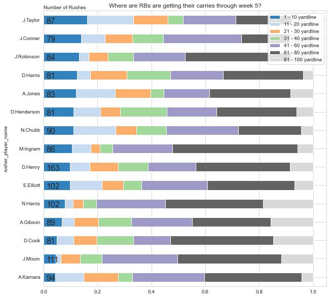
And that's our visualization!
The first thing that jumps out is the number of rushes Derrick Henry has. I knew it was a ton, but when you compare to some of the other top backs, nobody comes close to Henry's 163 rushes on the year.
Jonathon Taylor has really emerged the last couple weeks. Its nice to confirm his recent success with his high red zone rush percentage. Look for him to continue his great start to the season.
I was a bit surprised to see Mixon with so few redzone touches. This is something to keep an eye on along with his the ankle injury he has been nursing.
As a final note, running through this code again after every week will yield the updated results so I recommend trying it out to keep up with the rushing trends! Thanks for reading! Good luck in week 7!