If you have any questions about the code here, feel free to reach out to me on Twitter or on Reddit.
Shameless Plug Section
If you like Fantasy Football and have an interest in learning how to code, check out our
Ultimate Guide on Learning Python with Fantasy Football Online Course. Here is a link to purchase for
15% off. The course includes 15 chapters of material, 14 hours of video, hundreds of data sets, lifetime
updates, and a Slack channel invite to join the Fantasy Football with Python community.
If you haven’t read part one of the series yet, here’s a link to
that.
What We're Doing This Time
In this next part of the series we are going to delve a bit deeper into using Python and
pandas for analyzing the 2019 Fantasy Football season. In the last post, we really just set up an environment
and graphed usage vs. fantasy performance. If anything we just confirmed the already proverbial maxim of “Don’t
get cute, start your studs”. Usage is king, yes – but almost anyone who’s played FF for a couple seasons knows
that already. So let’s dive in and try to answer some better questions that will give you real FF insight and
build your Python skills at the same time.
The question we’re going to try to answer is about “stacking”. For those that don’t already
know, stacking is starting two or more players from the same team. Some people swear upon using stacks – and
it’s even helped people win some leagues (Tannehill and AJ Brown this season comes to mind).
How Stacking Works
Coming from a background in finance/accounting, I’ve always been hesitant about using
stacks. When choosing a portfolio of stocks – you should aim to diversify. Diversification is one of the only
free lunches in economics, as you have the potential to reduce your risk without altering your return. I always
intuitively applied that concept to FF, believing that if I diversified my starting lineup, I could reduce my
risk while keeping my return (points scored) the same. In future posts, I’ll get more into this concept of
diversification.
Sometimes though, you are projected to lose by a lot and you actually want to increase your
risk. Another principle in both Finance and Fantasy Football is that you can actually increase your potential
reward by increasing your level of risk exposure.
Think of it like this – it’s Monday Night, you’re down 30 points and you have the option of
starting Will Fuller or James White in PPR (Your opponent has no players left to play).
You start Will Fuller. Why? Because even though he made decide to pull his hamstring for
the 15th time in the season on the second play of the game, he has the potential to drop 50 for your team. With
James White, if you need 12 points, he’ll give you 13. But if you need 30 points on MNF – he’ll give you 13.
One way of increasing our risk to increase our potential reward is by stacking
positions who’s performances are highly correlated to each other. When I say risk, I mean the risk
that because one player has a bad game, another player has a bad game as a result. If you’re stacking – you run
the risk of both players having a bad game if they’re highly correlated. But here’s the thing – you can also
expose yourself to the potential of having a really good game if they both do well.
Anyways, if you’re in a bind one week where you’re projected to lose by 30 points, we’re
going to try to figure out what positions are most highly correlated so you can stack them to give you the best
chance to maybe win.
That’s enough theory for you to mull on, let’s start coding.
(PS – a user (/u/Justwastintime08) commented on my reddit post last week suggesting using Google Colab as a
quicker setup than anaconda/jupyter. That definitely works just as well)
Let's Code
Also, we’ll be using the same 2019 CSV file as part 1. I’ll link it again for those that
need it below.
In your anaconda prompt, cd to the directory you made last time and fire up a jupyter
notebook using the following command
jupyter notebook
You can either create a new notebook or continue on from the one in the previous post.
Either way, a lot of the setup is going to be the same.
import pandas as pd
import numpy as np
import seaborn as sns
from matplotlib import pyplot as plt
As you can see, one slight change at the top – we are going to be importing numpy now
along with pandas, seaborn, and pyplot. Numpy is another Python library
used commonly for data analysis. Numpy allows us to work with arrays – you’ll see what I mean by array in a
minute. Run Shift+Enter and ensure there are no import errors.
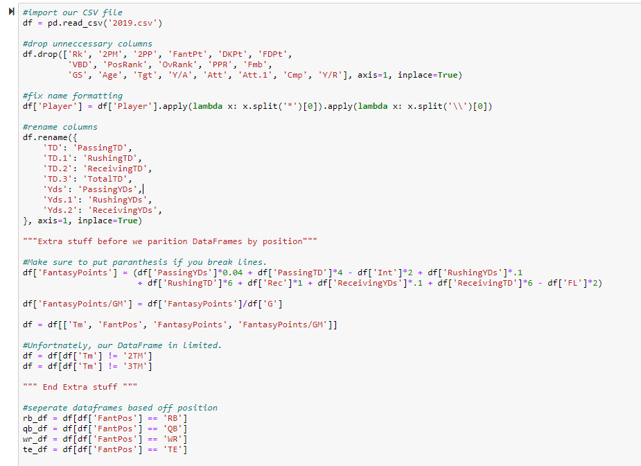
Our First Block of Code
This is essentially the same setup as last time, with some minor changes. We’re dropping
some extra columns, but in retrospect you don’t need to worry about that. One important thing to note however is
that we are adding some extra code before we split the DataFrame up by position. We create a new column for
FantasyPoints, using the other columns in our DataFrame. Again, I’m using PPR so I’m adding
receptions, but you’re welcome to change that based on your league settings. We then create a
FantasyPoints/GMcolumn, and you’ll see this will be the final value we use for evaluating
correlation between positions. After we create a new column for FantasyPoints, we are filtering our
DataFrame to only include the columns ‘Tm’, ‘FantPos’, ‘FantasyPoints’,
and ‘FantasyPoints/GM;. The syntax for filtering DataFrames based on column values is the following
below
df = df[["ColumnName", "ColumnName2",]]
Next, we remove players who played on two or more teams. Unfortunately, this means our
model won’t be 100% perfect, but it’ll be good enough. If you look through the original CSV, you’ll notice that
players that were traded or dropped and signed by other teams throughout the course of the year are listed as
either “2TM” or “3TM” under the ‘Tm’ column. If I were to attempt to fix every example of this in
this post, this post would get very, very long. So we’ll just have to live with the fact that Emmanuel Sanders
and Kenyan Drake won’t be included in our model. The syntax for how we filter out values we do not want is
almost exactly similar to how we filter based on values we do want. Instead of using a == operator
like we do to separate DataFrames based on position, we use a != operator.
Finally, we separate our DataFrames into 4 seperate DataFrames based on position just like in part
one.
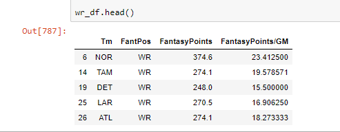
If you want, check out our new DataFrames by doing rb_df.head(),
wr_df.head(), qb_df.head(), or te_df.head() and hitting
Shift+Enter. You should see something similar to the above image.
Our Second Block of Code - Setting up The Heat Map
Now, what we are going to be doing in today’s post is creating a correlation matrix, and
then creating a heat map to help us visualize the results. That sounds complicated but once we get the data set
up correctly, pandas and seaborn take care of almost all the rest.
We want to find the correlation coefficients between QB1, RB1, RB2, WR1, WR2, WR3, and TE1 numbers.
We are going to do this by first finding the QB1, RB1, RB2, etc… for each team based on total FantasyPoints
scored, and then use those players FantasyPoints/GM value to determine the final correlation
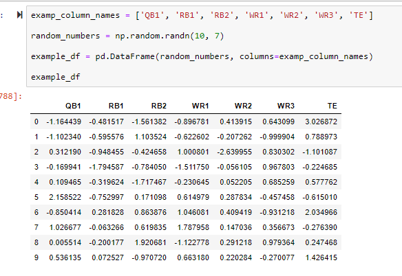
numbers. This will make a lot more sense once we go through the code. First, we are going to create a sample
table with random numbers so you can see what the final table should roughly look like right before we create
the correlation matrix and heat map.
Note: Don’t get confused, this is not our final table. I’m just showing you what the final
tables format will look like so we can know what we need to transform our four DataFrames into.
Even though this is purely for demonstration purposes, let’s run through the code because
there’s some new concepts here. I showed you in part one how to create a DataFrame based off the
pd.read_csv() file and then again by filtering based off some column value (when we separated the
DataFrame based off position). Well, you can also create pandas DataFrames by creating an instance of the
pd.DataFrame class, and passing through some data, and column values.
In the first line, we create a list of column name values to pass through to our DataFrame.
Easy enough. These column name values will actually be the names we use in our final DataFrame.
random_numbers = np.random.randn(10, 7)
Here’s where numpy comes into play. I told you numpy allows us to create arrays. The
np.random.randn(#of rows, # of columns) function allows us to create an array with specified dimensions (In this
case, 10 rows, 7 columns) and will fill that array with random numbers. There’s a lot more to numpy than this,
just as there’s a lot more to pandas. I advise you to check out the numpy docs here https://docs.scipy.org/doc/.
In our final DataFrame, these numbers will actually be the our FantasyPoints/GM numbers.
example_df = pd.DataFrame(random_numbers, columns =
example_columns)
We create a DataFrame by passing in our numpy data and column names, and voila – we have
our DataFrame. In our final DataFrame, the index will be the column ‘Tm’.
So this is what we need to shoot for to be able to calculate a correlation matrix. If you run
>example_df.corr(), you can see the correlation matrix for this DataFrame (This is how we’ll do it
with our final DataFrame also).
Here’s the process by which we create our final DataFrame. This code can get quite
complicated and we’re introducing a couple new concepts, so let’s go through it step by step.
Again, what we want to do is get the top QB, top TE, top 2 RB’s, and top 3 WR’s for each
team. What we are going to do is have 7 separate DataFrames and concatenate them altogether based on their
common index, the team they are on. The final result is going to look like the sample DataFrame we created
above.
Our Third Block of Code - Finishing up Our DataFrame
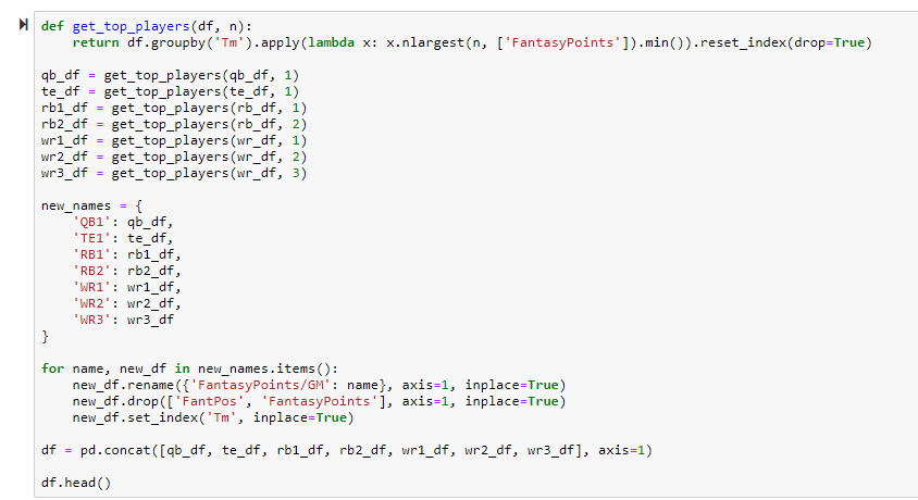
def get_top_players(df, n):
return df.groupby('Tm').apply(lambda x: x.nlargest(n, ['FantasyPoints']).min()).reset_index(drop=True)
Here is a helper function I wrote to be able to produce all 7 separate DataFrames and
reduce redundancy in our code.
First, we pass in our original DataFrame, and then use an extremely powerful tool in pandas
called groupby. It’s a built in method that allows us to group a DataFrame based on some column. We
are grouping by ‘Tm’ here because we want to evaluate QB1, RB1, RB2, etc.. numbers for each and every team. The
reason groupby is so powerful is because now we can apply a function across each and every group. We use
.apply to do this and we apply another built-in DataFrame method called nlargest. The
nlargest method returns the top n largest values (For example, if n=3, it will return the top 3 values), based
on the arguments given — n, and column value. The syntax for this required you to wrap the column name in
brackets. In this case, we want to find the players with the most fantasy points (or 2nd or 3rd most for RB2,
WR2, and WR3) at their given positions on their given team.
Where this may get confusing is the part where we use .min(). In pandas, the
.min() method is going to return the smallest value in a given group. To show why the
.min() method is used let’s say we want to create our WR3 DataFrame. We’d pass in
wr_df as our original DataFrame. We’d pass in n = 3. This will return us the top 3
WR’s for a given team. But if we want the WR3 for that team, we want the player with the lowest
FantasyPoints in that subgroup of the top 3 WR’s, hence why we use min. Try to run this through
your head for RB2 and WR2 and you’ll really see how it works.
The .reset_index(drop=True) is simply to reverse the indexing changes we made
with groupby. If you want to learn more about reset_index check out this post here from geeksforgeeks.
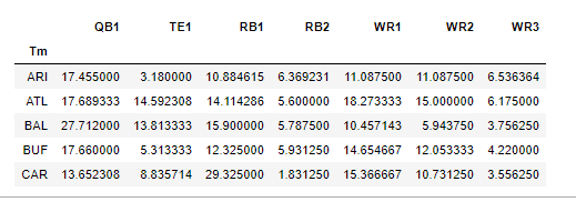
After we create the helper function, we use that function to create our 7 DataFrames.
new_names = {
'QB1': qb_df,
'TE1': te_df,
'RB1': rb1_df,
'RB2': rb2_df,
'WR1': wr1_df,
'WR2': wr2_df,
'WR3': wr3_df
}
We then create a dictionary to help us add those column names.
for name, new_df in
new_names.items():
new_df.rename({'FantasyPoints/GM':
name}, axis=1, inplace=True)
new_df.drop(['FantPos', 'FantasyPoints'], axis=1,
inplace=True)
new_df.set_index('Tm',
inplace=True)
We now use our dictionary and the built-in .items() method to iterate over our
dictionary of DataFrames. For each DataFrame, we are renaming the FantasyPoints/GM column, setting axis = 1 to
tell pandas we want to commit the change on the column axis, and setting inplace = True to save our changes as
permanent. We then drop our ‘FantPos’ and ‘FantasyPoints’ columns, as they are no
longer needed. We do the same thing with axis and inplace. We use the method .set_index() to set
our column ‘Tm’ as the DataFrame index.
df = pd.concat([qb_df, te_df, rb1_df, rb2_df, wr1_df, wr2_df,
wr3_df], axis=1)
Here is another method of creating a pandas DataFrame. We use pd.concat() to
concatenate multiple DataFrames together along their common index. We set axis = 1 to tell pandas that we want
to concatenate along the column axis (Essentially we are adding columns together). Run Shift+Enter to
see our final DataFrame.
Awesome, so now we have the QB1, RB1, RB2, WR1, WR2, WR3, and TE1 FantasyPoints/GM numbers
for each NFL team in the past 2019 season. Now we can move on to creating a correlation matrix and heat map.
To quickly view the correlation matrix before we move on, simple write
df.corr() with our new DataFrame and hit Shift+Enter.
Our Final Block of Code
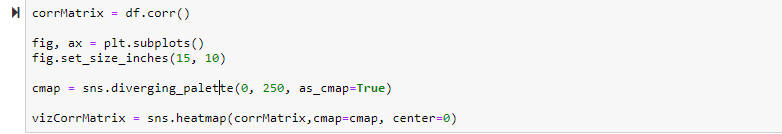
Okay, let’s run through this final piece of code.
We do df.corr() to create our correlation matrix. This is a built in method to
pandas that is super magical.
Like we did in part one, we use plt.subplots() to create our canvas upon which
our heatmap is going to be drawn upon, and set the dimensions to 15×10.
cmap = sns.diverging_palette(0, 250, as_cmap=True)
Here, cmap stands for color map. We use seaborn.diverging_palette to create,
well, a diverging palette. 0 and 250 are just numbers I always use because they are easy to remember, but play
around with the numbers and see what results you get. Setting the argument as_cmap equal to
True tells seaborn we want to use this as a color map.
vizCorrMatrix = sns.heatmap(corrMatrix,cmap=cmap,
center=0)
Finally, this is the code we use to generate a heatmap. Last week we used sns.regplot,
but now it’s sns.heatmap. We pass in our correlation matrix, our cmap, and set center =
0 to tell our heatmap to start changing colors at 0 (When there is no correlation).
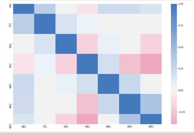
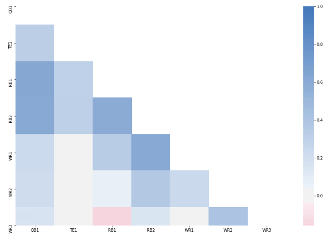
And there’s our heatmap!
How to Read the Heat Map and Takeaways
You read the heat map by looking at any row value, and matching it up with any given column
value. For example, let’s say I want to look at how WR1 and RB1 numbers are correlated. I would start at WR1 on
the y-axis, and then go across 3 units on the x-axis until I meet RB1. Then I would look at the scale, and see
where that colors on a scale from -1 to 1.
A correlation coefficient of 1 means perfectly positively correlated (You’ll notice that
when you look at QB1 versus QB1 you’ll get a value of 1. Try to think about why this makes sense), and -1 means
perfectly negatively correlated. Anything between 1 and 0 is positively correlated, and anything between 0 and
-1 is negatively correlated.
There is one more thing I’d like to fix about this heatmap (Try to think what it might be –
it has to do with redundancy). But this post is getting pretty long so I’m going to cut it short here.
Try to draw some conclusions from this heat map, see what you can come up with. Most
interestingly to me is that QB1 and RB1 numbers are almost entirely uncorrelated, meaning you can start both an
RB and QB from the same team and not increase your potential risk/reward. This can be either a good thing or bad
thing. If you’re expecting that by stacking a QB/RB you’ll increase your potential points, you probably won’t –
but you also probably don’t have to worry about exposing yourself to more risk.
Here’s a fun assignment, actually – try to see how this changes if you only include heavy
pass-catching RB’s in the heatmap. Let’s say running backs that only averaged 5 or more catches a game last
season. I have a feeling it will increase the correlation, but who knows (I mean, Christian McCaffrey had Kyle
Allen throwing to him almost all season).
In the next post, we’re going to continue working on this heat map and then come up with
some conclusions as to what implications it has for real life Fantasy Football. Thanks for reading, you guys are
awesome!
Check out
part three of the series here.