If you have any questions about the code here, feel free to reach out to me on Twitter or on Reddit.
Shameless Plug Section
If you like Fantasy Football and have an interest in learning how to code, check out our
Ultimate Guide on Learning Python with Fantasy Football Online Course. Here is a link to purchase for
15% off. The course includes 15 chapters of material, 14 hours of video, hundreds of data sets, lifetime
updates, and a Slack channel invite to join the Fantasy Football with Python community.
If you haven’t read part one of the series yet, here’s a link to
that.
What We'll Be Doing In This Part
For part three of the series, we are going to be continuing to work on our heat map. This
part will be shorter than previous parts and we’re just going to rough out some of the edges of our
visualization.
In the next couple days, I’ll release some new posts and move on to teaching you guys web
scraping and API’s to automate pulling fantasy data from the web. I’ve been getting a lot of requests for that
and it’s honestly really cool stuff.
In the posts after that, I’ll be covering some more useful topics like draft strategies.
This will include one huge concept that I think a lot of you will find useful – “Value Over Replacement”.
What we’re doing now (correlation matrices, heat maps, and stacking players) are all sort
of miscellaneous topics, and I’d like to move on to more useful material to help you win some FF games in 2020.
It’s just that the code/material for heatmaps was a good stepping stone in terms of complexity from what we were
doing with Pandas in part one.
Anyway, at the end of the last part, after we finished creating our heat map – I asked you
guys to think about two things. One was a small assignment to only include running backs that caught over 5
catches a day into our model. The theory was that a QB-RB stack would be more correlated in offenses where the
RB catches the ball a lot. To some people – that’s pretty obvious, but honestly, I didn’t even know for sure.
There’s a lot of weird, counter-intuitive stuff that happens in fantasy that you don’t always consider. When a
WR1 comes back from injury, for example, you would think your WR2 in that offense would suffer because of a
decrease in target share. But that also means that your WR2 won’t be drawing coverage from the teams best DBs
anymore.
Anyway, whether or not tweaking our model has any theoretical merit, let’s do it anyway –
it’ll be good practice.
I suspected there would actually be some increase in correlation though, and there was.
This is significant because if we were thinking about stacking QB-RB one week to get an extra push and looked at
our original heatmap – we’d probably decide against it. But if we had a pass catching back, with our new model,
we could see that stacking RB-QB might give us that extra variation to possibly win big.
Enough big picture stuff and theory, let’s get to coding.
Fire up your anaconda terminal, cd to your project directory, enter the command below, and
go back to the notebook we were using for part 2.
Let's Code
import pandas as pd
import numpy as np
import seaborn as sns
from matplotlib import pyplot as plt
pd.options.mode.chained_assignment = None
This goes in your first cell. Our first cell looks almost exactly the same as last time,
exact for that last line at the bottom.
That line there is really just to suppress a warning pandas tries to give us in the next cell. This
is optional – allowing the warning doesn’t really do anything, so don’t worry too much about it.
That’s a lot, but don’t worry we already wrote most of it in part two. And if you haven’t
read part two and you’re reading this, what are you doing here? Go
read part two!
By the way, if you want to keep the heat map as it was, that’s fine too. This is just to
show you how we can expand a bit on the map and maybe give you some ideas for some other avenues to take this.
The only really thing we’re doing different here is moving around some lines and filtering
out running backs with less than 5 catches per game.
We create a new column for catches/game with the following line.
rb_df['Rec/G'] = rb_df['Rec']/rb_df['G']
And you filter out running backs with less than 5 catches per game with the following line.
rb_df = rb_df[rb_df['Rec'] > 5]
You guys really should be good on most of this – every concept here has been covered in the
last two sections of the guide. If you have any questions though, leave me a comment below.
The second cell is the only cell that’s going to change for this first exercise.
The next three cells where we create the “sample” DataFrame, create the correlation matrix, and then
create the heatmap are literally exactly the same. You don’t have to change a thing. Just rerun the cells and
out comes your new heat map.
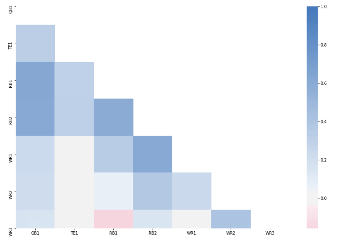
Our New Heat Map
As we discussed, you’ll see now that the correlation between QB and RB1 and RB2 is much
stronger. Play around with the variables and see how the heat map changes. Take out PPR and set it to standard
and see what happens. Change the minimum receptions to 3 instead of 5. Or maybe try to set some other qualifying
criteria for another position, like WR. Tweak whatever you want to test, but do expand upon this code. It’s the
best way to learn.
The second thing I told you guys to think about is how we could improve upon our
visualization and I gave you a hint that it had to do with redundancy.
Well, if you look at our heat map, you’d notice that it’s completely symmetrical and that
we only really need to include half of the heat map. You’ll also notice that when the same position matches up
with itself, for example, at QB-QB, the correlation is 1 and you end up with this diagonal row across our map.
Well, that’s kind of useless and redundant too so let’s try to get rid of that as well.
#This is for the Part 3 of the Python for Fantasy Football Analysis
fig, ax = plt.subplots()
fig.set_size_inches(15,10)
mask = np.zeros_like(corrMatrix, dtype=np.bool)
mask[np.triu.indices_from(mask)] = True
vizCorrMatrix = sns.heatmap(corrMatrix, mask=mask, cmap=cmap,
center=0)
Here’s the additional code to generate our new and improved heatmap. This goes in a new
cell.
We first create a new canvas because we’re creating a new map and we need a new canvas to
“draw” it on. We set the dimensions again to 15×10.
Next, we create a “mask”. We do this using the built-in Numpy function zeros_like. It
should look like a 7×7 numpy array with False for every value. Also, both pandas DataFrames and numpy arrays
have a shape attribute which tells you the object’s dimensions. Try running corrMatrix.shape and
mask.shape and verify that both objects have the same dimensions (Hint: they should). The function
zeros_like takes an argument of a DataFrame, then a dtype (or data type). The function returns a numpy array
with the same dimensions as our passed-in DataFrame, but with all the values set to zero. When we pass in a
dtype as a boolean, though, it returns the array with all the values set to False.
mask[np.triu_indices_from(mask)]
= True
This one is kind of tough to explain, but I’ll try my best.
Essentially with np.triu_indices_from(mask), we are getting the indices for
the “upper triangle” of our mask. The function name triu_indices_from is shorthand for “triangle
upper indices from”.
Think about what we’re doing with our heat map. Our heat map is a 7×7 square, so we are splitting it
up into two triangles diagonally, and then removing the upper triangle – the part that is redundant. To be able
to do that, you’ll see that seaborn allows us to pass in a “mask” variable to our heatmap that will not show a
specific cell if our passed-in mask tells it not to. The way we tell seaborn that we don’t want to show a cell
in our heat map is by passing in a separate array or DataFrame with the same dimensions as our correlation
matrix (np.zeros_like helped us with that). Moreover, our array or DataFrame we pass in as our mask
needs to have values of either True or False. Wherever seaborn sees that our mask has a cell that’s True, it
will look for the corresponding cell in our correlation matrix DataFrame, and then does not show that specific
cell.

We are essentially mapping True onto the upper triangle portion of our mask using
mask[np.triu_indeces_from(mask)] = True, then passing that in to our seaborn plot to tell seaborn
which corresponding/matching cells not to show in our heat map. The matching cells we do not want in our heat
map is those cells in the upper triangle of our map.
vizCorrMatrix = sns.heatmap(corrMatrix, mask=mask,cmap=cmap,
center=0)
Finally, we create our heatmap once again, this time passing in our mask, and voila – our new,
improved, and non-redundant heat map renders!
Thanks for reading. I’ll be updating you guys about the next post when it comes out in a
few days! If you made it this far, here, have a meme.
Apologies to my Ravens and Pats fans.