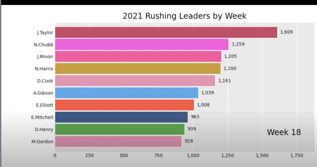
2021 Rushing Bar Chart Race!
Learn how to use Python by creating an animated bar chart!
Learn how to use Python by creating an animated bar chart!
In this blog post were going to walk through how to create an animated bar chart that shows how the rushing leaders changed over time throughout the 2021 season. The bar chart will display the season long rushing leaders at each week during the regular season. We can do this in three main steps: data retrieval, data manipulation, and plotting. Let's get straight away into it.
The first phase is the data retrieval phase. We are using play by play data across the 2021 and will pull this from NFLfastpy. Like always, start with the installation (if you don't have NFLfastpy already), and then use the load_pbp_data method to load in the data. Play by play data contains information for every play for the desired time period. So we'll be looking at 2021 data and using every rush from the entire season.
| play_id | game_id | old_game_id | home_team | away_team | season_type | week | posteam | posteam_type | defteam | ... | out_of_bounds | home_opening_kickoff | qb_epa | xyac_epa | xyac_mean_yardage | xyac_median_yardage | xyac_success | xyac_fd | xpass | pass_oe | |
|---|---|---|---|---|---|---|---|---|---|---|---|---|---|---|---|---|---|---|---|---|---|
| 0 | 1 | 2021_01_ARI_TEN | 2021091207 | TEN | ARI | REG | 1 | NaN | NaN | NaN | ... | 0 | 1 | NaN | NaN | NaN | NaN | NaN | NaN | NaN | NaN |
| 1 | 40 | 2021_01_ARI_TEN | 2021091207 | TEN | ARI | REG | 1 | TEN | home | ARI | ... | 0 | 1 | 0.000000 | NaN | NaN | NaN | NaN | NaN | NaN | NaN |
| 2 | 55 | 2021_01_ARI_TEN | 2021091207 | TEN | ARI | REG | 1 | TEN | home | ARI | ... | 0 | 1 | -1.399805 | NaN | NaN | NaN | NaN | NaN | 0.491433 | -49.143299 |
| 3 | 76 | 2021_01_ARI_TEN | 2021091207 | TEN | ARI | REG | 1 | TEN | home | ARI | ... | 0 | 1 | 0.032412 | 1.165133 | 5.803177 | 4.0 | 0.896654 | 0.125098 | 0.697346 | 30.265415 |
| 4 | 100 | 2021_01_ARI_TEN | 2021091207 | TEN | ARI | REG | 1 | TEN | home | ARI | ... | 0 | 1 | -1.532898 | 0.256036 | 4.147637 | 2.0 | 0.965009 | 0.965009 | 0.978253 | 2.174652 |
5 rows × 372 columns
We have worked with play by play data in the past and this time around we are going to focus on a few key features. In order to get NFL rushing leaders each week in 2021 we need to grab the rushing yards for each player, grouped by week. To do this we use the groupby method and sum. To understand what this looks like I selected Derrick Henry's rushing yards in each game. While doing this I noticed that our data includes playoff weeks, so we can filter that out in the next step. I always like to check that the data makes sense in the real life context it comes from, and in this case we only see data from week 1 until week 8 for Henry, after which he got hurt, so this checks out.
| rusher_id | rusher | week | yards_gained | |
|---|---|---|---|---|
| 550 | 00-0032764 | D.Henry | 1 | 58.0 |
| 551 | 00-0032764 | D.Henry | 2 | 182.0 |
| 552 | 00-0032764 | D.Henry | 3 | 115.0 |
| 553 | 00-0032764 | D.Henry | 4 | 157.0 |
| 554 | 00-0032764 | D.Henry | 5 | 130.0 |
| 555 | 00-0032764 | D.Henry | 6 | 143.0 |
| 556 | 00-0032764 | D.Henry | 7 | 86.0 |
| 557 | 00-0032764 | D.Henry | 8 | 68.0 |
| 558 | 00-0032764 | D.Henry | 20 | 62.0 |
Next we're going to work on formating the data to be plotted. The bar_chart_race package that we use for plotting requires a specific data format to properly work, so we're going to take a few steps to get it into a format that works well with that package. First we need to make a pivot table so that the index on the left is the NFL week, and the columns are players with their respective rushing yards.
| rusher | A.Abdullah | A.Armah | A.Bachman | A.Brewer | A.Brown | A.Collins | A.Dalton | A.Dillon | A.Dulin | A.Ekeler | ... | T.Tremble | T.Williams | V.Jefferson | W.Gallman | W.Smallwood | Z.Ertz | Z.Jones | Z.Moss | Z.Pascal | Z.Wilson |
|---|---|---|---|---|---|---|---|---|---|---|---|---|---|---|---|---|---|---|---|---|---|
| week | |||||||||||||||||||||
| 1 | 4.0 | NaN | NaN | NaN | 6.0 | NaN | NaN | 19.0 | NaN | 57.0 | ... | NaN | 65.0 | NaN | NaN | NaN | NaN | NaN | NaN | NaN | 2.0 |
| 2 | NaN | NaN | NaN | NaN | NaN | 25.0 | NaN | 18.0 | NaN | 56.0 | ... | NaN | 77.0 | NaN | NaN | NaN | NaN | NaN | 26.0 | NaN | -1.0 |
| 3 | 24.0 | 5.0 | NaN | NaN | 3.0 | 8.0 | NaN | 18.0 | -7.0 | 55.0 | ... | 7.0 | 22.0 | NaN | NaN | NaN | NaN | NaN | 60.0 | NaN | 2.0 |
| 4 | NaN | 2.0 | NaN | 0.0 | NaN | 44.0 | NaN | 81.0 | NaN | 117.0 | ... | NaN | NaN | NaN | 29.0 | NaN | NaN | NaN | 61.0 | NaN | -4.0 |
| 5 | 2.0 | NaN | NaN | NaN | NaN | 47.0 | NaN | 30.0 | NaN | 66.0 | ... | NaN | 6.0 | NaN | 2.0 | NaN | NaN | NaN | 37.0 | NaN | NaN |
5 rows × 370 columns
Now we have to fill the NaN values with 0. We see NaN values in the dataframe since these are instances when the players did not get rushes in the given week, hence they got 0 rushing yards. Lastly, we have to do a cumulative sum so that we are adding up the rushing yards for each player individually. We can do this with a cumsum() method.
| rusher | A.Abdullah | A.Armah | A.Bachman | A.Brewer | A.Brown | A.Collins | A.Dalton | A.Dillon | A.Dulin | A.Ekeler | ... | T.Tremble | T.Williams | V.Jefferson | W.Gallman | W.Smallwood | Z.Ertz | Z.Jones | Z.Moss | Z.Pascal | Z.Wilson |
|---|---|---|---|---|---|---|---|---|---|---|---|---|---|---|---|---|---|---|---|---|---|
| week | |||||||||||||||||||||
| 1 | 4.0 | 0.0 | 0.0 | 0.0 | 6.0 | 0.0 | 0.0 | 19.0 | 0.0 | 57.0 | ... | 0.0 | 65.0 | 0.0 | 0.0 | 0.0 | 0.0 | 0.0 | 0.0 | 0.0 | 2.0 |
| 2 | 4.0 | 0.0 | 0.0 | 0.0 | 6.0 | 25.0 | 0.0 | 37.0 | 0.0 | 113.0 | ... | 0.0 | 142.0 | 0.0 | 0.0 | 0.0 | 0.0 | 0.0 | 26.0 | 0.0 | -1.0 |
| 3 | 28.0 | 5.0 | 0.0 | 0.0 | 9.0 | 33.0 | 0.0 | 55.0 | -7.0 | 168.0 | ... | 7.0 | 164.0 | 0.0 | 0.0 | 0.0 | 0.0 | 0.0 | 86.0 | 0.0 | 2.0 |
| 4 | 28.0 | 7.0 | 0.0 | 0.0 | 9.0 | 77.0 | 0.0 | 136.0 | -7.0 | 285.0 | ... | 7.0 | 164.0 | 0.0 | 29.0 | 0.0 | 0.0 | 0.0 | 147.0 | 0.0 | -4.0 |
| 5 | 30.0 | 7.0 | 0.0 | 0.0 | 9.0 | 124.0 | 0.0 | 166.0 | -7.0 | 351.0 | ... | 7.0 | 170.0 | 0.0 | 31.0 | 0.0 | 0.0 | 0.0 | 184.0 | 0.0 | 0.0 |
5 rows × 370 columns
Next we clean up the size of the dataframe by only keeping the rows that will show up in the bar chart. To do this we loop through the data and only keep the top 10 at any given week. This step is not entirely necessary, but I thought it was best to clean up our data frame and get it plot ready.
| rusher | C.Edwards-Helaire | A.Ekeler | A.Kamara | D.Cook | M.Gordon | N.Chubb | D.Harris | D.Montgomery | A.Jones | C.Edmonds | ... | N.Harris | E.Elliott | E.Mitchell | C.Carson | J.Mixon | D.Henderson | M.Ingram | L.Fournette | J.Taylor | J.Robinson |
|---|---|---|---|---|---|---|---|---|---|---|---|---|---|---|---|---|---|---|---|---|---|
| week | |||||||||||||||||||||
| 1 | 43.0 | 57.0 | 83.0 | 61.0 | 101.0 | 83.0 | 100.0 | 108.0 | 9.0 | 63.0 | ... | 45.0 | 33.0 | 104.0 | 91.0 | 127.0 | 70.0 | 85.0 | 32.0 | 56.0 | 25.0 |
| 2 | 89.0 | 113.0 | 88.0 | 192.0 | 132.0 | 178.0 | 131.5 | 169.0 | 76.0 | 109.0 | ... | 83.0 | 104.0 | 146.0 | 122.0 | 196.0 | 123.0 | 126.0 | 84.0 | 83.0 | 72.0 |
| 3 | 189.0 | 168.0 | 177.0 | 192.0 | 192.0 | 262.0 | 145.5 | 203.0 | 158.0 | 135.0 | ... | 123.0 | 199.0 | 146.0 | 202.0 | 286.0 | 123.0 | 147.0 | 92.0 | 116.0 | 160.0 |
| 4 | 291.0 | 285.0 | 297.0 | 226.0 | 248.0 | 362.0 | 141.5 | 309.0 | 206.0 | 255.0 | ... | 185.0 | 342.0 | 146.0 | 232.0 | 353.0 | 212.0 | 171.0 | 184.0 | 167.5 | 238.0 |
| 5 | 304.0 | 351.0 | 368.0 | 226.0 | 282.0 | 523.0 | 199.5 | 309.0 | 309.0 | 270.0 | ... | 307.0 | 452.0 | 189.0 | 232.0 | 386.0 | 294.0 | 212.0 | 251.0 | 220.5 | 387.0 |
5 rows × 26 columns
Finally were ready to plot our data. To do this I found a package that fits our use case perfectly. It takes in a dataframe that is partitioned over time and allows the user flexibility to change timestamps and transitions. First we install the package and then plot our data. I recommend playing around with some of the features to see how the plot reacts. If you are doing this in Google Colab you should see a MP4 file pop up in the file tab on the left with our final result.
I was really happy with this result, I think visualization is one of the most important parts of data science. I've watched it many times over and every time you can notice something new. Like I mentioned earlier seeing Derrick Henry dominate over the first 8 weeks and then get injured is really cool to see in this type of plot, and he stayed in the top 10!
I hope you like this type of blog where we create a cool visual, and as always let me know if you have any questions.