Learn Python with Player Receiver Charts

Learn how to use Python by plotting receiver data on an animated field!
Learn how to use Python by plotting receiver data on an animated field!
Our mission at FFDP is to teach python and data science applied to something we all love, fantasy football. If you like Fantasy Football and have an interest in learning how to code, check out our Ultimate Guide on Learning Python with Fantasy Football Online Course. Here is a link to purchase for 15% off. The course includes 16 chapters of material, 14 hours of video, hundreds of data sets, lifetime updates, and a Slack channel invite to join the Fantasy Football with Python community. If this type of analysis peaks your interest I definitely recommend checking it out!
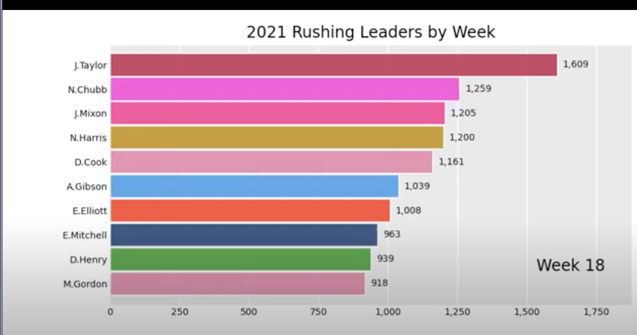
In this post I am continuing the theme recently with visualizations. Feel free to check out the last post where we discussed how to create a racing bar chart for the 2021 rushing leaders. Today we are looking at custom receiver charts. I came up with this idea when I was looking through box scores and thought to myself, what if I could physically see the stats on the field? When it comes to coding and python, all you need is an idea to get started!
The best place to start making headway on an idea like this is checking out NFLFastpy. We've used this time and time again on the site and essentially it is where we pull all the data used for analysis. In this post we'll be using 2021 play by play data and will focus in on DeAndre Hopkins week 1 stats versus the Tennessee Titans.
Let's first start by importing all the necessary packages. As always, feel free to follow along on your local machine or in google colab. The best way to learn is to try this out on your own (try different players, adapting to handle running backs, etc.). If you have any questions don't hesitate to ask!
Now that we have the packages imported and the data downloaded we can start the project! Like I mentioned earlier this is going to be data visualization heavy, so lets start by making a football field we can later plot onto. I am going to import a field I used in previous posts, and if you're interested in diving into the code to make this feel free to check out this post
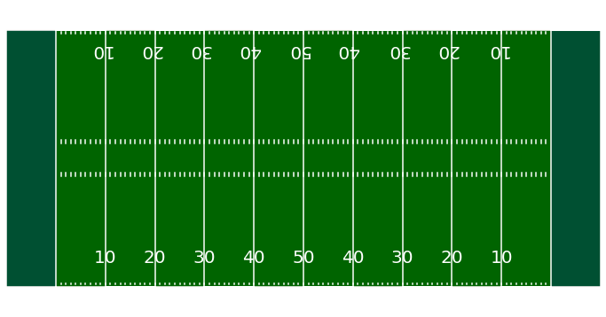
So that's the field! It looks pretty good, and the nicest part is it is actually to scale with the NFLFastpy play by play data. So for example if we have something like the snap taking place on the 47 yard line we will be able to plot 47 and it will show up in the right place. After creating the field its time to check out a function to plot each receiving play. So what data will we be plotting? Taking a look below we can see I selected relevant columns such as play_type, pass_location, air_yards, and yards_after_catch. This will be enough to make some cool visuals. My idea is to physically plot each passing play for DeAndre Hopkins in week 1. Since we have the pass direction, air yards, and yards after catch we can portray this information with a mixture of lines and colors. We will plot an angled line to represent the air yards in the direction of the throw, and then the running yards after the catch will be a straight line extending out. We can also utilize color to represent whether the play was a completed pass, incomplete pass, or a touch down. Now lets dive into the function that will do all this for us!
| play_type | pass_length | pass_location | air_yards | yards_after_catch | receiving_yards | td_player_id | incomplete_pass | receiver_player_name | receiver_player_id | yrdln | posteam | game_id | |
|---|---|---|---|---|---|---|---|---|---|---|---|---|---|
| 3 | pass | short | middle | 2.0 | 1.0 | 3.0 | NaN | 0.0 | D.Henry | 00-0032764 | TEN 22 | TEN | 2021_01_ARI_TEN |
| 4 | pass | short | right | 10.0 | NaN | NaN | NaN | 1.0 | C.Rogers | 00-0032355 | TEN 25 | TEN | 2021_01_ARI_TEN |
| 6 | pass | deep | left | 29.0 | 9.0 | 38.0 | NaN | 0.0 | D.Hopkins | 00-0030564 | ARI 39 | ARI | 2021_01_ARI_TEN |
| 8 | pass | short | left | -4.0 | 5.0 | 1.0 | NaN | 0.0 | C.Edmonds | 00-0034681 | TEN 31 | ARI | 2021_01_ARI_TEN |
| 9 | pass | deep | right | 20.0 | 1.0 | 21.0 | NaN | 0.0 | A.Green | 00-0027942 | TEN 30 | ARI | 2021_01_ARI_TEN |
If you don't completely understand that code cell don't worry! It took me a while to put it together and alot of it is minor math details. The helper function at the bottom of the cell essentially helps parse the play by play data into the yardline each snap started at. In our original dataframe the yardline is written as "TEN 22," meaning the ball was snapped on the Tennessee 22 yard line. This is fine except python doesn't know how to interpret "TEN 22." So what we have to do is convert it into a number that we can plot. So "TEN 22" in Arizona Cardinals perspective is actually 78 yards from their endzone. The function will return 78, and we can plot this.
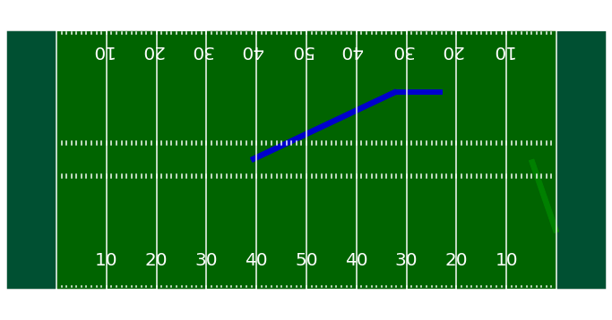
The last step of the process is cleaning up the dataframe and getting it plot ready. A couple minor details: I added in some jitter so it makes each individual catch easier to see clearly and avoid drawing catches directly on top of one another, added in touch down metric, and fixed yard line. In this first plot I am focusing on the first two catches from Hopkins in week 1 to show you exactly how to interpret the plot. If we look into the box score from ESPN we can see Hopkins had a pretty big catch, 38 yards, but the box score doesn't provide the side of the field Hopkins was on, how many yards he created after the catch, the yardline the play started and ended on, and so on. This is why I think the visual is so helpful, a picture is worth a thousand words. The second play plotted is a 5 yard touchdown from Kyler Murray, this is plotted in green.


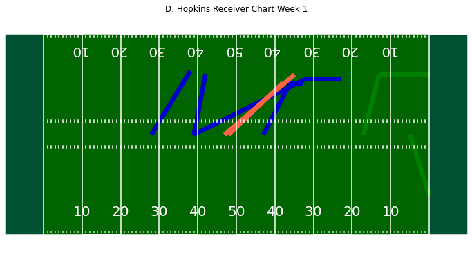
Now that you get the idea of why this is useful and how to interpret it, let's plot all the catches from that Sunday in week 1. I thought it was interesting to see the only play in which Hopkins went to the right side of the field was on the 5 yard touchdown, every other play that day was to the left side of the field. There are two plays in red since these were the two plays resulting in an incompletion and Hopkins was the target.
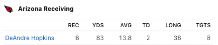
Finally I will conclude with a summarization table of Hopkin's stats for the day. The two rows that contain "NaN" values are the two incompletions thrown Hopkins' way. Its nice that we can investigate each pass thrown his way in an attempt to find underlying information a generic box score would normally overlook. I also attached the type of table you will see as a box score from ESPN or other sites. A standard box score is usually enough when it comes to evluating players, but I hope this post gives the perspective that there are other ways to look at data and sometimes putting multiple sources together yields exponentially more information than a singular source.
| Player | Air Yards | YAC | Yards | TD | |
|---|---|---|---|---|---|
| 1 | D.Hopkins | 29.0 | 9.0 | 38.0 | 0.0 |
| 2 | D.Hopkins | 5.0 | 0.0 | 5.0 | 1.0 |
| 3 | D.Hopkins | 3.0 | 0.0 | 3.0 | 0.0 |
| 4 | D.Hopkins | 10.0 | 0.0 | 10.0 | 0.0 |
| 5 | D.Hopkins | 4.0 | 13.0 | 17.0 | 1.0 |
| 6 | D.Hopkins | 14.0 | NaN | NaN | 0.0 |
| 7 | D.Hopkins | 7.0 | 3.0 | 10.0 | 0.0 |
| 8 | D.Hopkins | 18.0 | NaN | NaN | 0.0 |
| Total | NaN | 90.0 | 25.0 | 83.0 | 2.0 |
Thanks for reading! If you have any questions feel free to reach out, and go check out the course!
BACK TO
2021 Rushing Bar Chart Race!